8 Fantastic Product Blog Designs and What Makes Them So Good
Updated 31 May 2021 (Published 2 September 2020) by Miles in Website design & UX
For many software companies like SaaS products, their product blogs are one of the key channels to attract inbound leads. In this article, let’s review eight product blog designs, and what makes these examples work so well.
If you’ve read any of our other articles about blogging, you know how important I feel blogging is for businesses. None more so than cloud based products, who often have smaller marketing budgets and are taking a lean startup approach to growth. I often discuss the content and topics, however for this post let's turn out attention to product blog designs.
The following eight product blog designs have caught my attention more than once. I list them here, along with example blog posts and a few points on why I feel they work so well.
In alphabetical order, the product blog designs we will look at, are;
You can click on the product name to jump straight to that section, or just scroll down to read them all. So, without any further waffle, let’s get into it.
Autopilot
An Australian software product, Autopilot is all about marketing automation, such as in-app messaging, SMS, email marketing and more. The Autopilot blog topics reflect this, with product releases, trends, email optimisation and marketing.
What makes it so good
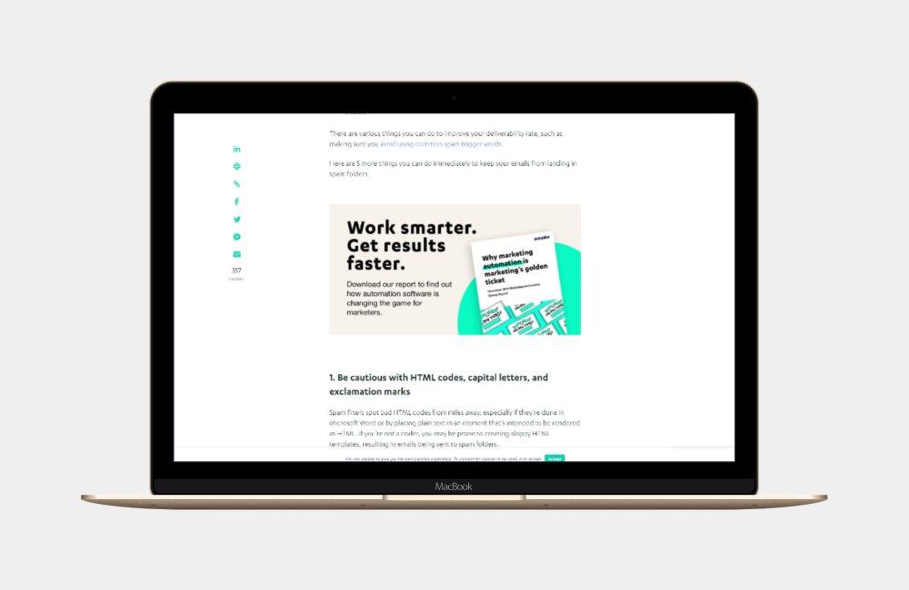
The Autopilot blog has a focus on bold hero images and beautiful type. The three main elements that attract me to reading their blog, are;
- The huge, bold banner images at the start of each post
- Their in-content CTA (Call to action) banner
- The use of static social sharing links down the left hand side
An example of this in action, is their post, How to identify lead source using UTM parameters.
Clearbit
Clearbit is a product that combines over 250 public and private data sources and sorts it into actionable business intelligence. The Clearbit blog covers topics such as new product releases, marketing, sales and more.
What makes it so good
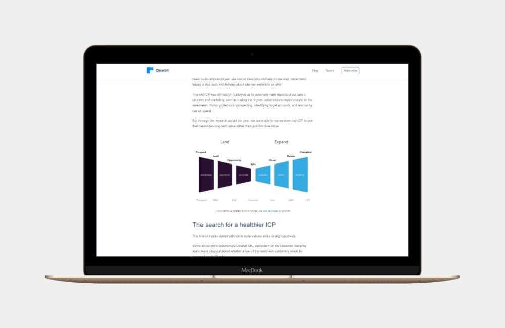
The Clearbit blog has a very white and minimalist layout, which is a nice change from many other websites. The main features about their design and content that get my attention, are;
- The super minimalist design, ensuring no distractions when reading
- The topics around transparency about their own business and marketing results
- The sticky top banner, which helps readers quickly get to topics and the subscribe form (which pops up)
An example of a nicely formatted post on the Clearbit blog, would be Searching for healthier revenue — the process behind Clearbit's new ideal customer profile.
Close
A very well known CRM, Close has a fantastic blog which is often referred to for the latest sales leadership, with many very helpful articles across the whole sales spectrum.
What makes it so good
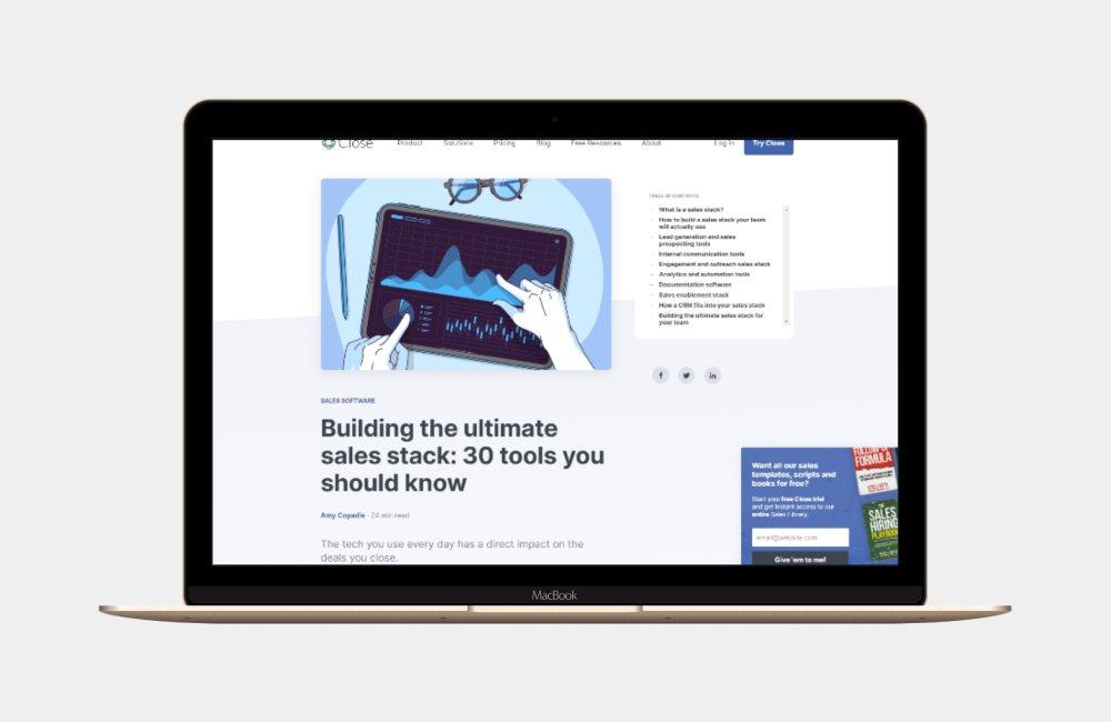
One of my favourite product blog designs, there are a few key features of the Close blog that I really enjoy. They are;
- The fixed width of body content which makes it very easy to read
- The nice line spacing, which encourages the eye
- The use of funny GIF's in content
- A table of contents which highlights what section you are on
A good post to view all the above in action, is How to sell consulting services: 12 methods you can start using today.
Helpscout
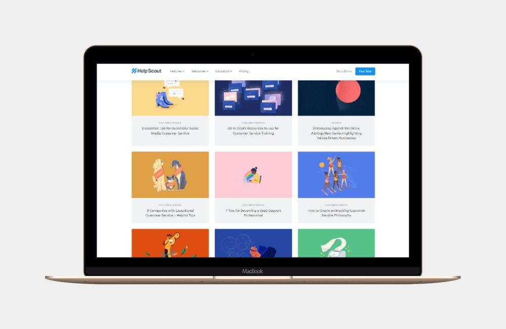
Helpscout is a support email and knowledge base solution used by thousands of customers across the globe. Their blog has a focus on customer support and experience, and every article they publish is always insightful.
What makes it so good
One of my absolutely favourite product blog designs, the Helpscout blog has had so much design love applied to it, which makes it a delight to read.
- The illustrations are beautiful and on brand throughout
- The main blog index page is very well laid out
- Every blog post has plenty for visuals to break up the often lengthy text
An example of their posts is 16 Research-Backed Customer Retention Strategies.
Podia
Podia allows course and digital product creators to sell membership and product access online. Things like membership, online courses, digital downloads and the like.
What makes it so good
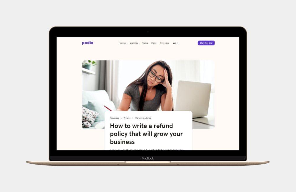
The Podia blog has a number of really good ways to encourage readers to stay engaged. These include
- Large hero images that break the standard width
- Fun GIF's within content
- Lots of links to back up their statements
- A great colour scheme, using purple in moderation
An example from the Podia blog is 6 video editing tips you can learn this weekend.
Slab
A product designed to help internal teams with knowledge management, Slab has a beautiful interface and a powerful wiki type product. As a result, their blog has a focus on writing and knowledge management.
What makes it so good
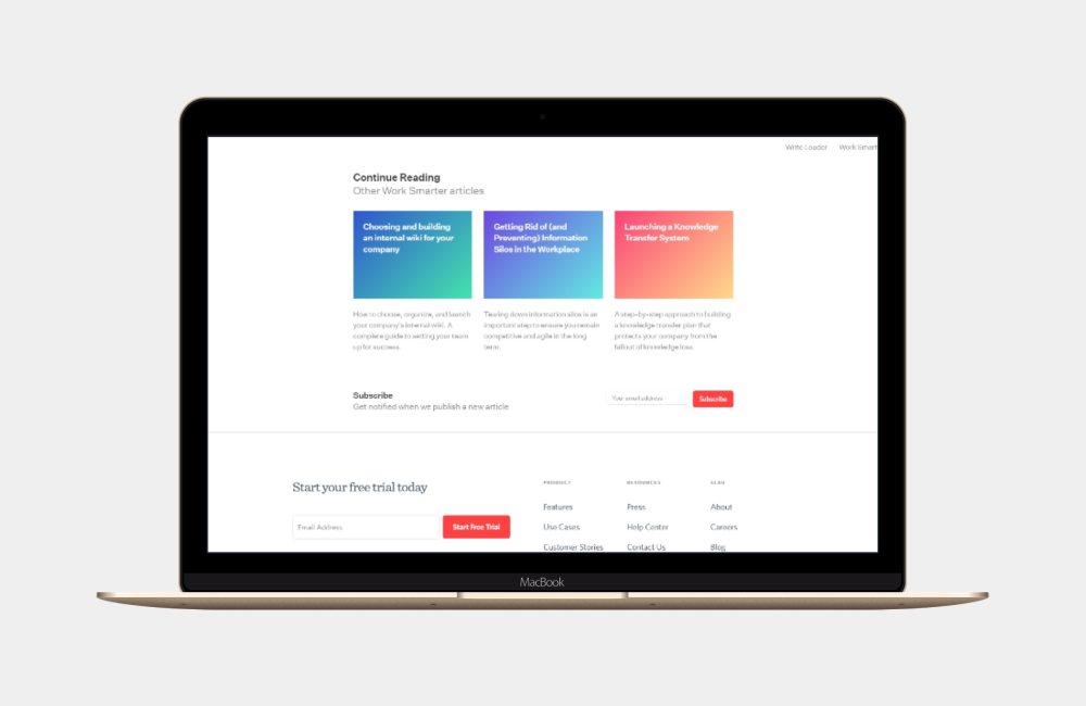
The Slab blog has a heavy reliance in type, rather than visuals. This seems to be reflective of the wiki product that they sell. This doesn't make their blog plain, however, with a few likes such as;
- Their three categories stay static at top right
- Great use of block quotes and headings plus sub headings
- A simple yet very legible and complimentary colour palette
A recent blog post of thiers, is The Financial Benefits of Remote Work for Companies.
Spaceship
An Australian startup, Spaceship is bringing the concept of personal finance in the form of investing, into popular mainstream by making it easy to invest. Their blog deals with topics like saving, investing and personal finance generally.
What makes it so good
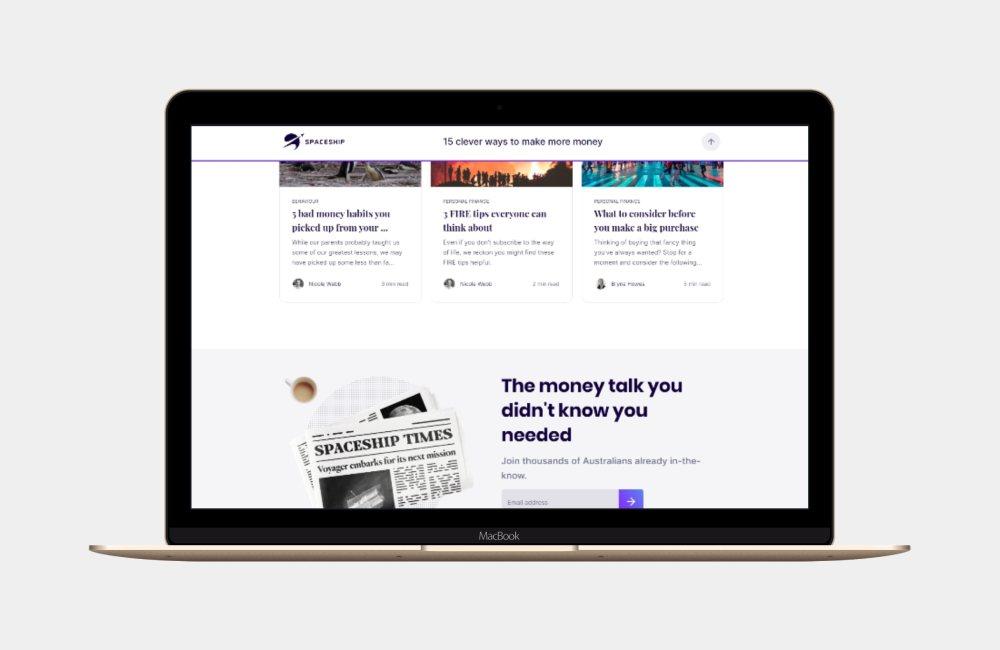
The Spaceship blog has a great way to make often boring topics sound interesting, and a pleasure to read. Features of their blog include;
- Their posts turning complex and boring topics into something approachable and interesting
- The two call to action panels in footer
- The usage of large type sizes for both headlines and body copy
- The use of a related articles panel
A post worth reading of theirs, is 15 clever ways to make more money.
Toggl
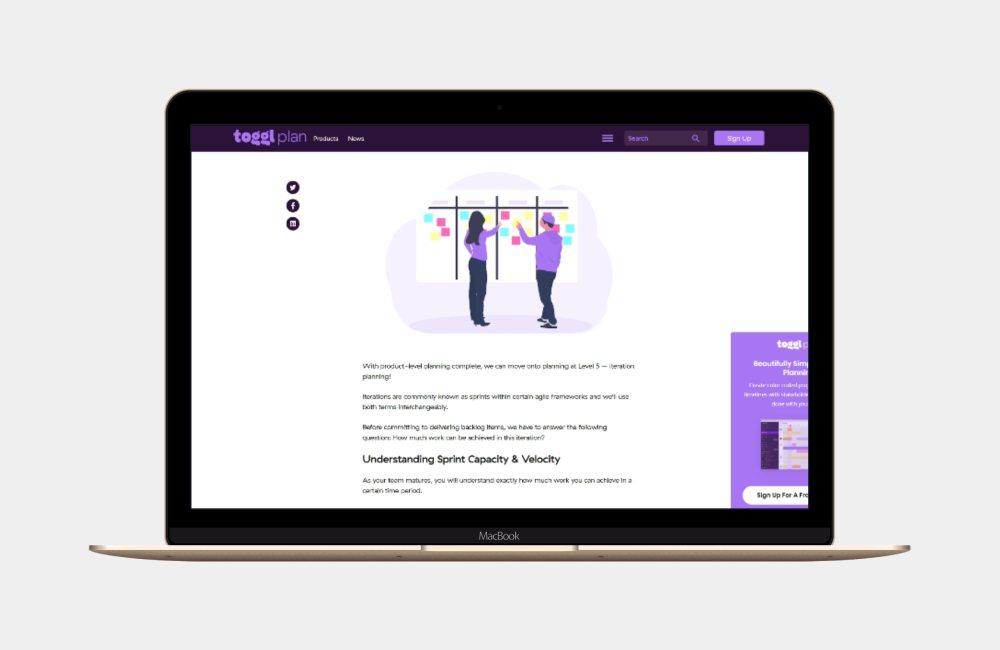
A time tracking product, Toggl is a very easy to use product, and has a large userbase across the globe. Their blog covers a wide range of topics such as hiring, remote work, productivity and work/life balance.
What makes it so good
The Toggl product blog designs have some beautiful elements that encourage an audience, such as;
- Plenty of illustrations within the posts
- Superb typeface choices throughout
- A deep footer helps you navigate into their product
- Encourage social sharing with left hand side buttons
A good blog post to see the above in action on the Toggl blog, is Agile Planning: A Beginner’s Guide To Planning & Executing Iterative Projects.
In Summary
No matter what sort of blog you are publishing or creating, I am positive you’ll find some inspiration in the list of product blog designs above. Whilst blogging is important for inbound traffic, thanks to SEO, it’s equally as important that the blog is readable and attractive to your human visitors.
Ensure you spend some time in reviewing your existing blog, and comparing it to these examples of product blog designs. Is there an element you could include, or a way to tweak your design to be more appealing? You should make this a regular habit, as well as constantly reviewing your overall blog content planning and workflows.


